Whitepaper: Decoding the Human-Centered Interface
A Neuroscientific Blueprint for Effective Design Systems and UI Redesign

Preface
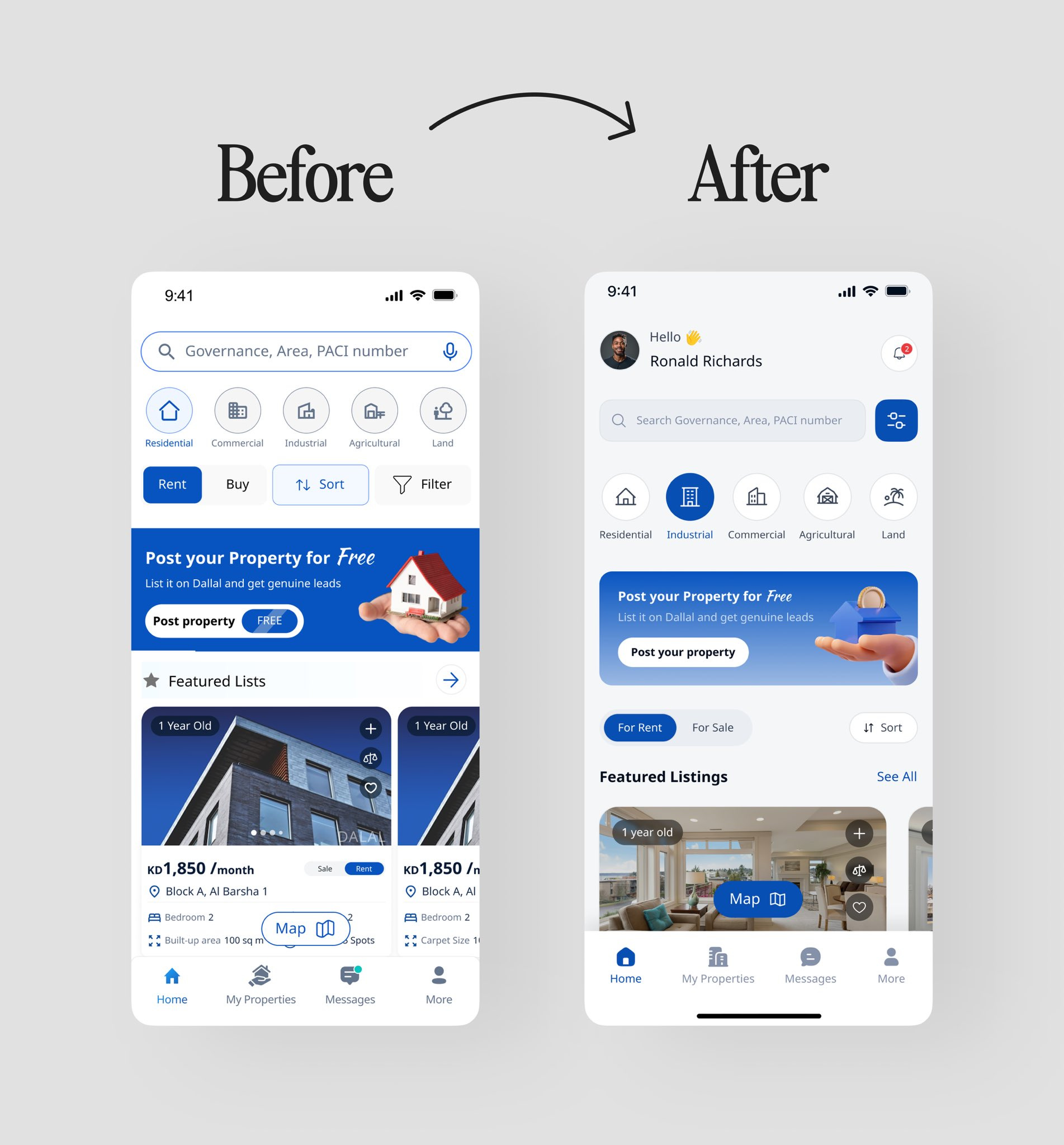
@Abmankendrick's "Real Estate Home Screen Redesign ✨" has truly captured the attention of the design community, sparking widespread admiration across social media. Users are celebrating the transformation with enthusiastic remarks like "Looks great" and "10x better ui". Many have praised the elevated aesthetic, with one comment highlighting how "the padding on the sides and use of white space really make it look premium 👏👏", while another profoundly states, "Before served a purpose. After serves the experience". Abraham John's work has been lauded as "a good home redesign," standing out among "hundreds" seen in a week, underscoring the significant achievement in crafting a more intuitive, visually cohesive, and user-centric experience.
Analysis of User Interface Improvements
As a professional and student of user experience and user interface design, I've analyzed the comments and the detailed breakdowns of the "before" and "after" images, identifying key improvements that leverage principles of UI/UX, cognitive science, and neuroscience to enhance the user experience.
1. Header & Personalization
Before: The top of the screen was an empty space, lacking personalization.
After: Abraham John introduced a personalized greeting, "Hello, Ronald Richards," complete with a user profile picture and a notification icon.
Improvements: This change aims to make the user feel immediately recognized and welcomed, transforming the app from a generic tool into a "personal service". The notification icon also provides accessible access to critical updates.
2. Search & Filtering Controls
Before: The search bar was standard, but filtering options like "Rent," "Buy," "Sort," and "Filter" displayed a disjointed mix of styles.
After: The search bar was streamlined with a dedicated filter icon. Primary actions "For Rent" and "For Sale" were redesigned as lighter, toggle-style buttons. The "Sort" function was repositioned contextually next to the "Featured Listings" heading.
Improvements: Consolidating search parameters reduces visual clutter and provides an efficient UI pattern. The toggle buttons are visually lighter. By placing "Sort" directly next to the list it affects, the design creates a stronger contextual relationship, aligning with user expectations and improving intuitive navigation. @VisualLogicUX specifically praised the "Swapping “Rent / Buy” chips with a dynamic content toggle" as feeling "more aligned with how users actually search. Intent-first > UI clutter". @kpirkovikj also appreciated the "more minimal" filters.
3. Property Type Selection
Before: Icons were contained within heavy, solid circles, and the selected state ("Industrial") was indicated by an overpowering solid blue rectangle.
After: Icons were refined into lighter line art, and the selected state is now subtly conveyed by filling the icon within a rounded "pill" shape, accompanied by a bolded label.
Improvements: This represents a more modern and elegant UI, significantly reducing visual noise. It employs a sophisticated multi-faceted approach using color, icon style, and typography to indicate selection, making it "easier on the eyes and looks cleaner".
4. "Post your Property" Call-to-Action (CTA)
Before: The banner was visually jarring due to an aggressive dark blue color, a realistic stock photo that clashed with the flat UI, and an awkwardly placed "FREE" tag.
After: The banner now features a softer gradient background, a clean, stylized 3D illustration that harmonizes with the digital aesthetic, and a more prominent button.
Improvements: This change significantly enhances visual cohesion, as the illustration style perfectly integrates with a modern app interface, fostering a more professional and trustworthy brand image. The new design is more appealing and less resembles a cheap banner ad, which can increase user trust and engagement. As @tuskdesignn aptly put it, "Before served a purpose. After serves the experience".
5. Featured Listings & Property Cards
Before: Property cards were dark, cramped, and featured an oddly shaped floating "Map" button that obstructed images. Information was presented as a simple list without clear user actions.
After: The property cards are now light, airy, and use soft shadows to create depth. Generous white space dramatically improves readability. Standard UI elements, such as a clean, rectangular "Map" button and universally understood icons for "Add to comparison" (+) and "Favorite" (♡), were introduced, along with a "See All" link.
Improvements: The light background enhances text readability, while ample white space improves legibility and reduces visual fatigue. The action icons provide clear affordances for users, enabling them to save and compare listings directly from the home screen, which improves critical user flows and discoverability. @DesignsWithRyan specifically noted, "the padding on the sides and use of white space really make it look premium 👏👏".
6. Bottom Navigation Bar
Before: Icons were basic, and the active state was indicated solely by color. The "More" tab was a generic, often ambiguous label.
After: Icons were refined, and the active state ("Home") is now highlighted with a clear, pill-shaped background. Significantly, "More" was replaced with "Profile".
Improvements: Replacing "More" with "Profile" is a substantial UX improvement, as it elevates user-specific content (e.g., listings, saved properties, settings) to a primary navigation level, aligning with a user-centric design strategy and greatly improving findability. The pill-shaped active indicator is a modern and visually distinct pattern that provides unambiguous system feedback to the user.
How does the human brain process these user interface improvements?

Introduction
The transformative redesign of Abraham John's real estate home screen offers a compelling case study in the application of advanced UI/UX principles. Moving beyond mere aesthetic appeal, the "After" design demonstrates a profound understanding of human cognition and neurobiology, translating abstract theories into tangible improvements that enhance usability, reduce cognitive load, and foster a more engaging user experience. This white paper delves into the scientific underpinnings of these design choices, meticulously dissecting how each improvement—from color palette and typography to spacing and imagery—is rooted in established principles of cognitive science and neuroscience, providing a robust framework for creating truly intuitive and impactful digital interfaces.
Executive Summary
In the competitive landscape of digital products, an intuitive user interface is no longer a luxury, rather, it is the primary driver of user engagement, retention, and trust. While designers often speak of "clean" or "user-friendly" interfaces, the principles that make a design truly effective are deeply rooted in the fundamental wiring of the human brain. This paper dissects a real-world UI redesign, moving beyond a simple aesthetic critique to reveal the underlying cognitive and neuroscientific principles at play. By analyzing the transformation from a functional but cluttered interface to a streamlined, personalized experience, we will establish a robust design system and demonstrate how its rules are validated by decades of research into human perception, cognition, and decision-making. For professionals in Product Design, UX, Human Factors, and Human-Centered Design, this analysis provides a scientific foundation for design choices, transforming subjective preference into evidence-based strategy.
Section 1: The Case Study - A Transformation in User Experience
The "Before" interface is functional. It presents key features like search, product categories, and listings. However, it suffers from common design ailments: a lack of visual hierarchy, inconsistent component styling, high cognitive load due to visual clutter, and an impersonal, tool-like feel. Dark, heavy elements compete for attention, and key user actions like saving or comparing are absent.
The "After" interface is a paradigm shift. It is clean, personalized, and visually harmonious. It introduces a welcoming header, refines search and filtering into intuitive components, and uses a light, airy design with generous white space. Most importantly, it introduces clear affordances for user action and establishes a visual language that is both modern and cohesive. This transformation serves as our blueprint for deconstructing excellence.
Section 2: From Redesign to Rulebook: A Principled Design System
The success of the "After" interface is not accidental; it is the result of applying a consistent set of principles. From this redesign, we can extract a formal design system that could be scaled across an entire product.
Color Palette: Employ a single, bright primary color for interactive elements and calls-to-action. Utilize a neutral palette (whites, light grays) for backgrounds to create a clean canvas, and use high-contrast, off-black text for optimal readability.
Typography: Establish a clear and consistent type scale to create a strong visual hierarchy. Use font weight (e.g., bold, semibold) as a secondary tool to denote importance and selected states.
Spacing & Layout: Be generous with white space (negative space) to reduce clutter and improve comprehension. Implement a consistent grid and corner radius to create visual rhythm, harmony, and a sense of professional polish.
Iconography: Maintain a single, consistent icon style (e.g., outline for inactive, solid for active). Crucially, in primary navigation, always pair icons with clear text labels to eliminate ambiguity.
Components: Use elevation (soft shadows) to make interactive components like cards feel tangible and distinct. Employ a clear button hierarchy (primary vs. secondary) to guide users toward the most important actions.
Imagery: Favor stylized, brand-aligned illustrations over generic stock photography to create a unique brand identity and maintain visual cohesion within the digital interface.
Section 3: The Cognitive Blueprint - Why These Rules Work
A design system is only as strong as its rationale. The validity of these rules is grounded in the field of cognitive science, which explains how the human mind processes information.
On Color: The strategic use of a single primary color leverages pre-attentive processing, allowing users to spot interactive elements without conscious effort. The clean, neutral background dramatically reduces cognitive load, freeing up the user's finite working memory to focus on their goals, not on deciphering the interface.
On Typography: A strong typographic hierarchy supports our natural saccadic eye movements, creating clear "landing pads" for the eye to jump to. It aligns with our pre-existing mental schemas of how information should be structured, making the content feel intuitive and easy to scan.
On Spacing: Generous white space is the most powerful tool for applying the Gestalt Principle of Proximity, which states that we perceive objects close to each other as a single group. This allows for effective chunking, breaking down complex information into digestible units that are easier for our working memory to handle.
On Iconography: Pairing icons with labels is a direct application of the core usability principle of Recognition over Recall. It eliminates the cognitive strain of remembering an icon's function. This approach also engages Dual-Coding Theory, which posits that information presented both visually (icon) and verbally (text) creates a stronger, more memorable mental representation.
On Components: Shadows are powerful signifiers that create a sense of affordance—they tap into our real-world understanding of light and depth to suggest that an element is interactive. A button hierarchy simplifies decision-making, aligning with Hick's Law by making the desired path of action visually distinct and reducing choice paralysis.
On Imagery: A cohesive visual style avoids cognitive dissonance, the mental discomfort experienced when holding conflicting beliefs or perceptions (e.g., "this is a modern app" vs. "this is a cheap stock photo"). This fosters a positive emotional response, which is linked to the Aesthetic-Usability Effect, a phenomenon where users perceive beautiful designs as being more functional.
Section 4: The Neuroscientific Foundation - Design for the Brain
To truly anchor our design system, we can trace these cognitive principles to their biological roots in neuroscience.
Color & Attention: A bright, high-contrast button provides a "pop-out" signal in the Primary Visual Cortex (V1). This signal is flagged by the brain's Salience Network (Anterior Cingulate Cortex and Insula), which automatically directs attention, all while the clean background reduces the metabolic load on the Prefrontal Cortex (PFC), the brain's executive control center.
Typography & Memory: Our mental schemas for text are not abstract; they are efficient neural circuits strengthened over time by Long-Term Potentiation (LTP). A familiar typographic hierarchy allows the brain to use these pre-built pathways, making comprehension faster and neurologically efficient while avoiding "prediction error" signals.
Spacing & Perception: The Gestalt principles are a direct result of the brain's architecture. The retinotopic map in V1 means that elements close together on the screen are processed by physically adjacent neurons, which are hardwired to group their activity. This pre-organized information is then delivered as a "chunk" to the working memory networks in the parietal and frontal lobes.
Iconography & Comprehension: A labeled icon engages two distinct neural pathways: the ventral visual stream for object recognition (the icon) and the brain's language centers (e.g., Wicke's area) for the text. This multi-modal input leads to more robust encoding in the hippocampus, the seat of memory formation.
Components & Interaction: Shadows provide depth cues that are processed by the dorsal visual stream, the "where/how" pathway that guides motor actions, effectively priming the brain for interaction. A clear primary button biases value assignment in the Orbitofrontal Cortex (OFC), streamlining value-based decision-making.
Imagery & Emotion: Visual inconsistency can trigger a conflict-monitoring signal in the Anterior Cingulate Cortex (ACC), creating dissonance. Conversely, an aesthetically pleasing and cohesive illustration can activate the brain's reward circuits, including the OFC, leading to a subtle release of dopamine and fostering a positive emotional connection to the product.
Section 5: Conclusion - The Unified Framework from Neurons to Pixels
Exceptional user experience is not a matter of taste; it is a science. As we have demonstrated, a direct and unbroken chain of logic flows from the fundamental operations of the brain to the practical application of a design system rule. The retinotopic mapping of our visual cortex dictates why white space is effective. The metabolic cost of PFC activity explains why minimalism is calming. The dopamine-releasing potential of the reward circuit shows why beauty is more than skin deep.
By understanding this unified framework, designers and product leaders can advocate for user-centric design not as a subjective art, but as an evidence-based discipline. We can build products that are not just functional, but are fundamentally aligned with how our users' brains are wired to see, think, and feel.
Continue your journey into evidence-based design. For more deep dives, industry analysis, and actionable insights, subscribe to j2pro.substack.
References
Friston, Karl. "The Free-Energy Principle: A Unified Brain Theory?" Nature Reviews Neuroscience, vol. 11, no. 2, Feb. 2010, pp. 127–38, doi:10.1038/nrn2787.
Frost, Brad. Atomic Design. Brad Frost, 2016.
Hebb, D. O. The Organization of Behavior: A Neuropsychological Theory. Wiley, 1949.
Kahneman, Daniel. Thinking, Fast and Slow. Farrar, Straus and Giroux, 2011.
Kandel, Eric R., et al. Principles of Neural Science. 5th ed., McGraw-Hill Medical, 2013.
Koffka, Kurt. Principles of Gestalt Psychology. Harcourt, Brace & World, 1935.
Kurosu, Masaaki, and Kaori Kashimura. "Apparent Usability vs. Inherent Usability: Experimental Analysis on the Determinants of the Apparent Usability." Conference Companion on Human Factors in Computing Systems (CHI '95), ACM, 1995, pp. 292–93, doi:10.1145/223355.223680.
Nielsen, Jakob. "10 Usability Heuristics for User Interface Design." Nielsen Norman Group, 24 Apr. 1994, www.nngroup.com/articles/ten-usability-heuristics/.
Norman, Donald A. The Design of Everyday Things: Revised and Expanded Edition. Basic Books, 2013.
Paivio, Allan. Mental Representations: A Dual Coding Approach. Oxford University Press, 1986.
Sweller, John. "Cognitive Load Theory." The Psychology of Learning and Motivation, edited by Brian H. Ross, vol. 55, Academic Press, 2011, pp. 37–76, doi:10.1016/B978-0-12-387691-1.00002-8.
Ungerleider, Leslie G., and Mortimer Mishkin. "Two Cortical Visual Systems." Analysis of Visual Behavior, edited by David J. Ingle et al., The MIT Press, 1982, pp. 549-86.
About Julian Gutierrez
Julian Gutierrez is a recognized strategic leader in UX Architecture and Product Design, possessing over 25 years of experience dedicated to bridging complex technology with human-centered design, particularly within highly regulated industries such as healthcare, aerospace, and government (including Leidos QTC Health Services, NASA JPL, and NSF). His professional practice is fundamentally data-driven, guided by the principle that “Data is the first teacher,” which informs evidence-based design and AI-augmented methodologies utilized to de-risk complex modernization initiatives.
Mr. Gutierrez specializes in scaling enterprise systems, leading large-scale UX transformations across more than 30 cross-functional teams, and integrating rigorous Compliance-by-Design frameworks—including HIPAA, accessibility (WCAG), and data privacy/GDPR—into the product lifecycle. His impact is empirically demonstrated by pioneering frameworks that have achieved a 92.5% reduction in project rework for applications utilizing his design systems, boosted user retention by 40–60% in high-stakes environments, and reduced vendor costs by 75% through AI-augmented requirements and vetting processes.
A deep commitment to artificial intelligence is central to his current focus, encompassing secure Generative AI and Retrieval-Augmented Generation (RAG) platforms, as well as the creation of robust Human-AI trust frameworks. He pioneered the Leidos’s first AI Safety & Ethics framework for health applications and innovated AI-augmented UX validation techniques that combine Object-Oriented User Experience (OOUX) principles with Large Language Models, leading to up to a 20x acceleration in prototyping and complex data synthesis. Mr. Gutierrez is also the Founder of the CaliFlyAI Academy, an AI literacy education platform dedicated to translating complex technical concepts into clear, actionable, and responsible solutions. His mission remains consistent: “Architect clarity from chaos—empowering teams and products to perform at their best”.
Media Contact
For inquiries regarding AI strategy, enterprise architecture, Compliance-by-Design frameworks, or keynote speaking engagements:
Julian Gutierrez - Principal, AI Product Strategist | Enterprise Content Strategy & AI Product Design | Design Systems, Compliance-by-Design & RFP Strategy | Mixed-Methods UI/UX Innovation | Figma Research Team
Email: julian@j2pro.net
Website: j2pro.net
LinkedIn: https://www.linkedin.com/in/jvgutierrez
Location: Los Angeles, California, United States of America
#UIDesign #UXDesign #ProductDesign #UserExperience #CognitiveScience #Neuroscience #HCD #HumanFactors #ValueCenteredDesign